Westinghouse
Partner: Paula Scher
Designer: Kirstin Huber, Billie Rene, Yansong Yang
Project Manager: Olivia Ray
Designer: Kirstin Huber, Billie Rene, Yansong Yang
Project Manager: Olivia Ray
George Westinghouse was a true pioneer of
the industrial age. An inventor, engineer, and
entrepreneur, he is best known for his contributions
to the development of electricity, particularly the
creation of the alternating current (AC) system.
Westinghouse’s collaboration with Nikola Tesla, a
brilliant young engineer and inventor, proved to be
a turning point in the so-called War of Currents, a
bitter battle between AC and direct current (DC)
proponents. Westinghouse’s AC system, which he
and Tesla developed and marketed, revolutionized
the world and forever changed the way we power
our homes, businesses, and cities.
The Westinghouse logo, undoubtedly one of the
most iconic corporate symbols in American history,
was created in 1959 by the legendary graphic
designer Paul Rand. However, Westinghouse
did not incorporate other brand languages, and
because they have been running in a licensing
business mode, the online appeals of each licensee
are hard to control. These resulting inconsistencies
across the whole brand. We were tasked to bring
everything back together and create guidelines for
licensees to follow.
︎ westinghouse.com
︎ westinghouse.com/pages/about
︎ westinghouse.com
︎ westinghouse.com/pages/about

Problem
Licensing model:
Different licensees perceive the brand in different ways. This lack of consistency in brand perception could weaken the overall brand identity and create confusion among customers.
-
Lacking brand perception and differentiation:
Besides Paul Rand’s logo, Westinghouse utilized very few of Rand’s original brand language. As a result, without the logo present, the brand appeared similar to its competitors. The brand needed to inspire confidence and trust while establishing a distinct visual identity to differentiate itself effectively.
Website issues:
The old Westinghouse website lacked discoverability, hierarchy, and consistent visuals. Contents were fighting against each other for attention. The website primarily acted as a shell site that redirected users to different divisions within the brand, creating a disjointed user experience and inconsistency and confusion even further.
-
Need for guidelines:
No guidelines for licensees resulting in inconsistent brand languages and user experiences across the different sites.
Goal
Improve site infrastructure and user flows:
To provide clear and intuitive user flows, making it easier for visitors to navigate and find the information they need.
-
Reduce clutter and highlight products:
Streamline the website design to reduce information and visual clutter, placing a stronger emphasis on showcasing Westinghouse’s products. This will help users focus on the key offerings.
-
Organize products into key categories:
Well-defined categories will improve the website’s navigation and make it easier for users to find relevant products.
Utilize lifestyle photography for emotional connection:
Showcasing products in real-life scenarios can evoke positive emotions and help customers envision how the products can enhance their lives.-
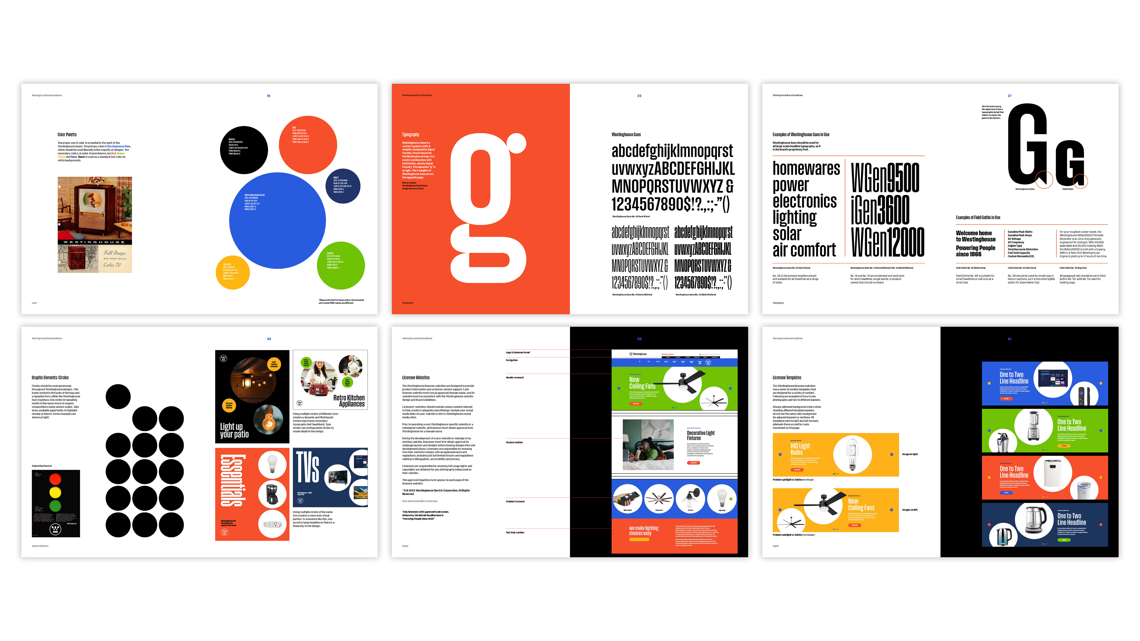
Revisit original brand languages:
Active more brand elements to help reestablish the overall languages and ensure that all design elements and brand visuals remain consistent with new materials. This consistency will help maintain brand recognition and preserve the timeless and iconic nature of the Westinghouse brand. -
Create key visuals and guidelines for licensees:
Guidelines/manuals for licensees can follow to ensure consistency across their individual sites. This will help maintain a unified brand experience while allowing licensees to represent and benefit from the Westinghouse brand effectively.
Audience

Brand Characters & Opportunities
These characteristics give us a responsive system
for how we communicate our work and approach in
a consistent fashion across the brand.

Pain Points & Solutions

Design


Design System / Guidelines